

Data visualization is a key component of exploratory data analysis that is useful for data cleaning, identifying outliers and feature relationships, and so on. Interactive Python libraries like Matplotlib or Seaborn allow data scientists to draw fast insights, but when the data is stored in a cloud data warehouse such as BigQuery this is not possible.
Why Use Ponder?
Usually visualizing data stored in a cloud data warehouse would require exporting the data to CSV or a spreadsheet like Google Sheets and using BI tools like Looker or Tableau. Ponder helps users skip a few steps by enabling users to run data science libraries directly in the data warehouse!
In this post, we’ll walk through an example that will explore a dataset through various visualizations. You can download the associated notebook here. To learn more about Ponder, check out our recent blogpost.
Try Ponder Today
Start running pandas and NumPy in your database within minutes!
Visualizing the NYC Yellow Taxi Dataset
Our dataset is from a sample of NYC Yellow Taxi trip records on January 1st, 2015. We store this data in a Google BigQuery table and perform data transformations directly operating on this data store and visualizations using Matplotlib.
The NYC Yellow Taxi dataset contains information regarding trips taken by passengers, including dropoff and pickup times, passenger count, tip amount, and total ride cost.
Connecting to BigQuery
To start querying our data, we need to set up our BigQuery connection.
import ponder.bigquery
import json
import os
import modin.pandas as pd
import matplotlib.pyplot as plt
import numpy as np
# Load your BigQuery service account key file
creds = json.load(open(os.path.expanduser("bigquery_key.json")))# Initialize the BigQuery connection
bigquery_con = ponder.bigquery.connect(creds, schema="PONDER", client_row_transfer_limit=300_000)
ponder.bigquery.init(bigquery_con)Here we read in our data and do some processing to make sure there are more than 0 passengers in a taxi ride.
df = pd.read_csv("https://raw.githubusercontent.com/ponder-org/ponder-datasets/main/yellow_tripdata_2015_BQ_demo.csv", header=0)
df = df[df['PASSENGER_COUNT']>0]
df = df.drop(['CONGESTION_SURCHARGE','AIRPORT_FEE', ' '],1)
Let’s start with investigating the tip amounts. How much do people tip percentage-wise based on their total charge?
df2 = df.loc[df['TIP_AMOUNT']>0]
fig, ax = plt.subplots()
plt.figure(figsize=(15, 3))
ax.hist(df2['TIP_AMOUNT']*100.0/df2['TOTAL_AMOUNT'], bins=100)
ax.set_title("Distribution of Tip Percentage")
ax.set_ylabel('Count')
ax.set_xlabel('% Tipped')
plt.show()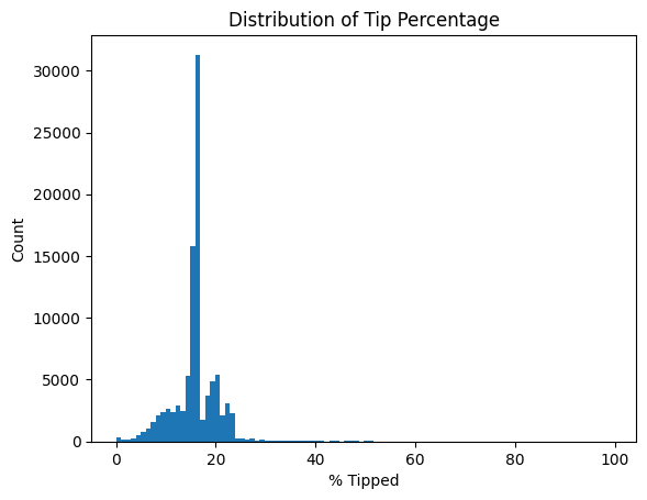
Here we see that most people tip 15-18% of their total taxi ride amount, which is not surprising. We make sure to not include tip amounts equal to 0 as those would result in a zero division error. Notice that we can easily intermix pandas and visualization code, and it all gets seamlessly handled by Ponder.
Now let’s find the proportion of passengers taking taxi rides. Pie charts are not that popular these days, but in honor of Pie Day just passing recently we feel obliged to include one.
df_passcount = df.groupby(['PASSENGER_COUNT']).count()['Index']
x = df_passcount
colors = plt.get_cmap('Blues')(np.linspace(0.3, 0.9, len(x)))
fig, ax = plt.subplots()
ax.pie(x, labels=df_passcount.index, colors=colors,
wedgeprops={"linewidth": 1, "edgecolor": "white"})
ax.set_title("Taxi Rides Passenger Count")
plt.show()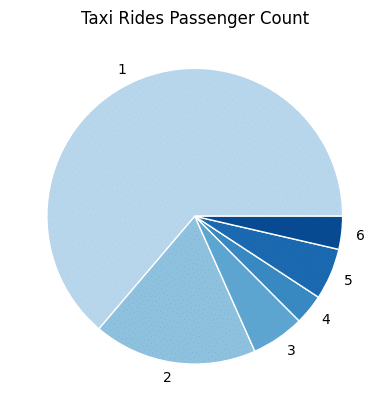
Interestingly, there are more solo rides than those with 2 passengers. Perhaps this is contributing to the NYC road congestion? Also, it looks like there are fewer trips with 4 riders than rides in a 5-seater taxi (or 6 riders which legally assumes a child under 7 years-old is in a 5-seater taxi).
We can also see how the fare amounts change throughout the day based on the dropoff times.
import matplotlib.dates as mdates
dropoff = pd.to_datetime(df.TPEP_DROPOFF_DATETIME)
plt.figure(figsize=(150, 5))
fig, ax = plt.subplots()
plt.xticks(rotation=30)
ax.set_xlabel('Dropoff Time')
ax.set_ylabel('Fare Amount')
ax.scatter(dropoff, df.FARE_AMOUNT, s=4)
plt.show()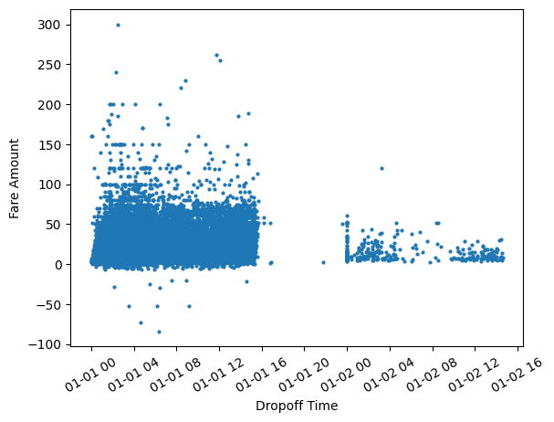
Are those negative fare values? This shouldn’t be possible, so let’s clean our data and regenerate this visualization.
df = df[df['FARE_AMOUNT']>=0]
dropoff = pd.to_datetime(df.TPEP_DROPOFF_DATETIME)
plt.figure(figsize=(150, 5))
fig, ax = plt.subplots()
plt.xticks(rotation=30)
ax.set_xlabel('Dropoff Time')
ax.set_ylabel('Fare Amount')
ax.scatter(dropoff, df.FARE_AMOUNT, s=4)
plt.show()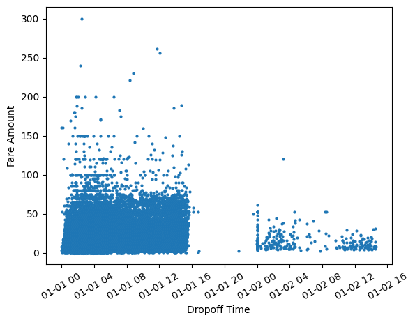
That was fairly simple! Interleaving data cleaning and visualization steps are natural with Ponder.
We notice that the fares are higher with taxi drop off times closer to 12 AM. The sharp gap shows that there are much fewer trips made past 3 PM and rides pick up again towards midnight. This however reflects the sample of records taken from January 1st, 2015 rather than rider behavior. Without the visualization, we might not have realized we were operating on a sample rather than the entire dataset.
Also, let’s take a moment to reflect on how straightforward it was to convert the TPEP_DROPOFF_DATETIME column to pandas datetime which Matplotlib can use to plot time series data out of the box.
How does the number of passengers impact trip cost features?
df_pass_tip_fare = df.groupby('PASSENGER_COUNT').mean()[['FARE_AMOUNT', 'TIP_AMOUNT','TOLLS_AMOUNT', 'TOTAL_AMOUNT']].reset_index()
x = df_pass_tip_fare.PASSENGER_COUNT
y = {
"Tolls": df_<span style="background-color: initial;font-family: inherit;font-size: inherit;color: initial">pass_tip_fare.TOLLS_AMOUNT.to_numpy(),</span>
"Tip": df_pass_tip_fare.TIP_AMOUNT.to_numpy(),
"Fare": df_pass_tip_fare.FARE_AMOUNT.to_numpy(),
"Total": df_pass_tip_fare.TOTAL_AMOUNT.to_numpy(),
}
width = 0.2  # the width of the bars
multiplier = 0
fig, ax = plt.subplots(layout='constrained')
for attribute, measurement in y.items():
offset = width * multiplier
rects = ax.bar(x + offset, measurement, width, label=attribute)
#ax.bar_label(rects, padding=3)
multiplier += 1
ax.set_title("Comparing Trip Cost Across Number of Passengers")
ax.set_xlabel('Passenger Count')
ax.set_ylabel('Amount ($)')
ax.legend(loc='upper left', ncols=3)
ax.set_ylim(0, 20)
plt.show()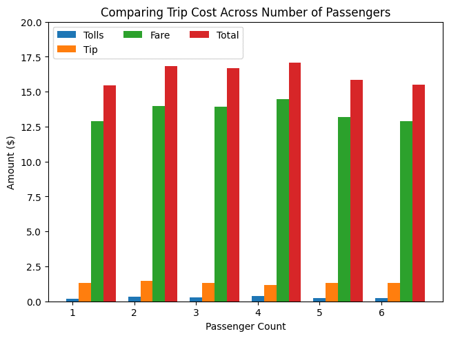
We see that overall taxi costs are fairly uniform across passenger count. Since taxi fares are based on meters that calculate trip distance and time, this makes sense!
To find out if trip distance affects tip amounts, we can use hexagonal binning to plot density efficiently.
fig, ax = plt.subplots()
hb = ax.hexbin(x, y, cmap='inferno')
ax.set(xlim=(0, 15), ylim=(0, 6))
ax.set_xlabel('Trip Distance')
ax.set_ylabel('Tip Amount($)')
ax.set_title("Hexagon binning")
cb = fig.colorbar(hb, ax=ax, label='counts')
plt.show()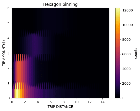
From this visualization, we see that while the tip amount generally increases with distance, the relationship is non-linear. There is also a significant occurrence of the tip remaining below $1 as distance increases. However, we must consider that this may not fully reflect NYC riders’ tipping behaviors as cash tips were not included in this dataset.
Summary
In this post, we saw how easy it is to visualize data in your data warehouse using Ponder without needing to export data to any other format. All the pandas operations were running directly in BigQuery and we used Matplotlib to generate visualizations to iterate on findings. When irregularities were found, we could quickly clean our data using vanilla pandas and regenerate plots accordingly. No longer do users have to rerun SQL queries, download their data as a CSV file or a spreadsheet, and connect to BI tools for exploratory data analysis.
Interested in trying this out for yourself? Sign up here to get started in using Ponder!